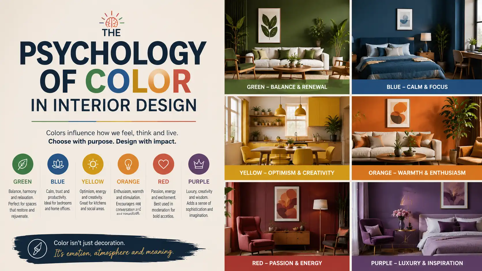
Walk into a room painted a deep, moody navy and something shifts — you feel enveloped, a little quieter, more contained. Step into a bright, lemon-yellow kitchen and your energy lifts almost involuntarily. These reactions aren’t coincidental or purely personal. They’re grounded in decades of research into how human beings perceive and respond to color, and interior designers have been applying these principles for as long as the profession has existed.
Color is one of the most powerful tools available to anyone designing or decorating a home — and also one of the most misunderstood. Many people choose paint colors based on what looks appealing on a small chip at the hardware store, only to find the result completely unexpected on four walls under their specific lighting. Others follow trends without considering whether a particular color actually supports how they want to feel in a space.
Understanding the psychology of color changes the way you approach every decorating decision. It helps you move beyond “I like this color” toward “this color will make this room feel the way I want it to feel.” In this guide, you’ll learn what research and professional practice tell us about how different colors affect mood, perception, and wellbeing — and how to use that knowledge to make smarter, more intentional choices in your own home.
How Color Affects the Human Brain
The relationship between color and emotion is rooted in both biology and cultural conditioning. Some responses to color are remarkably consistent across cultures — humans broadly associate warm colors like red and orange with heat, energy, and urgency, and cool colors like blue and green with calm, water, and sky. These associations appear to be partly hardwired through evolutionary experience.
Other color associations are more culturally specific. White signifies purity and simplicity in many Western contexts but is associated with mourning in parts of East Asia. Red means luck and celebration in Chinese culture but danger or aggression in many Western contexts. When designing spaces used by people from diverse backgrounds, this layer of cultural meaning is worth considering.
What’s most relevant for interior design is the emotional and physiological response color can trigger:
- Warm colors (reds, oranges, yellows) tend to raise energy, stimulate appetite, and increase perceived warmth and intimacy
- Cool colors (blues, greens, purples) tend to lower heart rate, reduce stress, and create a sense of calm and spaciousness
- Neutrals (whites, beiges, greys, taupes) provide psychological breathing room, reduce visual noise, and support focus
- Dark, saturated colors create intimacy, drama, and a sense of enclosure — which can feel cozy or overwhelming depending on the space and person
- Light, pale tones open spaces up visually, feel clean and fresh, and support a sense of possibility and calm
Color and Spatial Perception
One of the most practically useful aspects of color psychology for homeowners is how color affects perceived size and proportion. This is particularly valuable in homes where square footage is limited or room proportions are awkward.
Making Rooms Feel Larger
Light, cool colors — soft whites, pale blues, light grey-greens — reflect more light and push walls visually outward, making rooms feel larger than they are. Painting walls, trim, and ceiling in the same light tone eliminates contrast at the edges of a room, which further extends perceived space.
High-gloss finishes also reflect light and add a sense of depth, which is why they’re often recommended for small bathrooms or dark hallways.
Making Rooms Feel Cozier
Darker, warmer colors — deep greens, warm terracotta, rich navy — absorb light and bring walls closer visually, which creates a sense of enclosure and intimacy. This is particularly effective in large, high-ceilinged rooms that might otherwise feel cold or cavernous.
Painting only the ceiling a darker tone can lower the perceived ceiling height and create a sheltered, cocoon-like feeling — a technique sometimes called a “fifth wall” approach.
Correcting Proportional Problems
Color can also address specific architectural issues. A long, narrow hallway can feel more proportional if the far wall is painted in a slightly deeper or warmer tone than the side walls, visually shortening the perceived distance. A room with a disproportionately high ceiling can feel more grounded if the upper walls and ceiling are painted in a slightly darker shade than the lower walls.
The Psychology of Individual Colors
Blue
Blue is consistently rated as one of the most universally liked colors, and its effects in interior spaces are well-documented. It lowers heart rate and blood pressure, promotes calm, and supports concentration. Lighter blues feel airy and clean; deeper blues feel sophisticated and enveloping.
Best rooms for blue: bedrooms, bathrooms, home offices, and reading rooms. Use cautiously in kitchens and dining rooms, where it can suppress appetite and make food look less appealing. In north-facing rooms with limited natural light, cool blues can feel cold and unwelcoming — warm up the effect with natural wood tones and warm-toned textiles.
Green
Green sits at the intersection of warm and cool on the color spectrum, making it one of the most versatile and universally flattering choices for interiors. It’s associated with nature, rest, and restoration. Research from environmental psychology consistently links exposure to green with reduced stress and improved mood.
Best rooms for green: living rooms, bedrooms, home offices, and kitchens. Deep forest greens and sage tones have experienced a significant surge in popularity for good reason — they work beautifully with natural wood, aged brass hardware, and warm neutrals, creating interiors that feel grounded and alive without being loud.
Yellow
Yellow is the most luminous color on the spectrum, associated with sunshine, optimism, and energy. In small doses and the right shades, it can lift mood and add warmth to naturally dark spaces. However, it is also the color most sensitive to undertone — a yellow that reads as warm and buttery in daylight can look greenish or sickly under artificial light.
Best rooms for yellow: kitchens, breakfast nooks, hallways, and bathrooms. Avoid as the primary wall color in large living spaces or bedrooms, where its intensity can become fatiguing. Mustard and ochre tones are significantly easier to live with than bright primary yellow and have more design longevity.
Red
Red is the most physiologically stimulating color — it raises heart rate, increases appetite, and commands attention. These qualities make it a powerful accent color but a challenging primary choice for most residential spaces. Red has a proven track record in dining rooms, where its appetite-stimulating properties and sense of warmth create a convivial atmosphere.
Best rooms for red: dining rooms, entryways, and powder rooms. Use as an accent in living rooms through artwork, cushions, and rugs rather than as a dominant wall color. Deep, muted reds — burgundy, terracotta, brick — are easier to live with than bright or cool-toned reds.
Orange
Orange shares red’s warmth and appetite-stimulating qualities with slightly less intensity. It’s energetic, social, and inviting. However, it requires a careful hand — the wrong shade can easily read as dated or garish. The most successful contemporary uses of orange lean toward earthy, muted versions: terracotta, clay, and warm amber tones rather than bright citrus or rust.
Best rooms for orange: kitchens, dining areas, and entryways. Works well in rooms where social interaction is the primary activity.
Purple
Purple combines the calm of blue with the warmth of red, creating a complex color associated with creativity, introspection, and luxury. Lighter lavenders feel romantic and restful; deep plums and aubergines feel dramatic and rich. It can be challenging to use well because it’s sensitive to light and has strong associations that don’t suit every household.
Best rooms for purple: bedrooms and creative studios. Works best when kept to one feature wall or used in soft furnishings rather than as an all-over wall color.
White and Near-Whites
White is simultaneously the simplest and most complex color choice in interior design. There are hundreds of white paint options, and they vary enormously in undertone — some read as cool and clinical, others as warm and creamy, others as slightly pink or grey depending on the light. A white that looks pristine in a south-facing showroom can look dingy in a north-facing bedroom.
White spaces feel clean, open, and flexible — they support any furniture style or color palette. However, pure white can also feel cold, stark, or impersonal in residential settings. Near-whites with warm undertones — soft cream, warm linen, pale greige — offer the same sense of openness with significantly more comfort and livability.
Grey
Grey has been the dominant neutral in interior design for over a decade, and while its peak moment has passed, it remains a versatile and sophisticated choice when selected thoughtfully. The critical variable is undertone — grey can read as blue, green, purple, or brown depending on the light, and it behaves very differently in warm versus cool-toned spaces.
Warm greys (those with a slight beige or taupe undertone) are generally easier to live with in residential settings. Cool, blue-toned greys work beautifully in contemporary and industrial interiors with natural light but can feel cold and institutional in north-facing rooms.
Building a Cohesive Color Palette
One of the most common mistakes homeowners make is choosing colors room by room without considering how they flow together. When you stand in the hallway and can see into the living room, kitchen, and a bedroom, the colors in those spaces are in conversation with each other. A cohesive palette creates a sense of calm flow through a home; a disjointed one creates visual noise and can make a home feel smaller and more chaotic.
The 60-30-10 Rule
A foundational principle in interior color design is the 60-30-10 rule: 60 percent of a room’s color should come from a dominant color (typically walls and large upholstered furniture), 30 percent from a secondary color (upholstery, window treatments, rugs), and 10 percent from an accent color (cushions, artwork, decorative objects).
This ratio prevents any single color from overwhelming a space while creating visual interest and definition.
Using an Undertone-Based System
Professional designers often build palettes around a consistent undertone rather than matching colors directly. For example, a home with warm undertones throughout — creamy whites, warm beige, muted terracotta, earthy greens — will feel cohesive even if no two rooms are the same color. The consistency of the undertone creates harmony without monotony.
Testing Before Committing
Paint large sample swatches — at least 12 by 12 inches — and observe them at different times of day and under different artificial lighting before committing. A color that reads beautifully in morning light may shift significantly under evening lamp light. Most paint brands now offer sample pots for exactly this purpose.
Color Mistakes to Avoid
- Choosing paint last — paint is the most flexible and affordable element of a room, so it should be chosen after you have your major furniture and flooring. Paint can match almost anything; your sofa cannot.
- Ignoring natural light direction — north-facing rooms receive cooler, more indirect light; south-facing rooms receive warm, direct light. A color that works beautifully in one orientation can fail in another.
- Painting only one small test square — color looks completely different at scale. A small swatch on the wall will always look darker and more saturated than the final result on four full walls.
- Forgetting the ceiling and trim — the color conversation in a room includes the ceiling, trim, and any architectural details. Painting these in the default builder’s white when everything else is warm-toned creates jarring contrast.
- Following trends without considering your light — a moody, dark green looks stunning in a well-lit room photographed for a magazine. In your actual north-facing spare bedroom, it may feel oppressive.
Frequently Asked Questions
What is the most calming color for a bedroom?
Research and design practice consistently point to soft blues, muted greens, and warm neutral tones as the most calming choices for bedrooms. These colors are associated with rest, nature, and low stimulation. Pale blue-green tones are particularly effective because they combine the calm of blue with the restorative quality of green. The finish matters too — matte or eggshell finishes absorb light and feel more restful than satin or semi-gloss.
Should every room in the house be a different color?
Not necessarily. A cohesive home palette typically uses one or two main tones that flow through connected spaces, with variations and accents that give individual rooms their own character. Using a completely different color in every room can make a home feel disjointed and smaller. The key is to establish a consistent undertone family — all warm, all cool, or all earthy — even if the specific colors vary from room to room.
How does lighting affect paint color?
Lighting is arguably the most important factor in how a paint color reads in a finished room. Natural light changes throughout the day — from the cool blue of morning light to the warm amber of evening sun. Artificial light sources vary enormously: incandescent bulbs add warmth, cool-toned LED bulbs push colors toward blue and grey, and warm LED bulbs enrich warm tones. Always test paint colors under your specific lighting conditions before committing to them.
Is it a good idea to paint small rooms dark colors?
Counterintuitively, yes — in the right context. Dark colors in a small room can eliminate the visual distraction of corners and edges, creating a sense of depth and immersion that actually makes the room feel intentional rather than cramped. This works best in spaces like powder rooms, small studies, or walk-in closets where the purpose of the room is clear and you’re not trying to create an illusion of open space.
What colors make a home look more expensive?
Colors that read as sophisticated rather than safe tend to be more complex in their formulation — they have more depth and are harder to describe in a single word. Deep, muted tones like forest green, navy, warm charcoal, dusty plum, and earthy terracotta typically read as more intentional and refined than bright primaries or standard beige. Pairing a complex wall color with crisp white trim also creates a polished, high-end effect.
Does color in a home affect resale value?
Research from real estate studies suggests that certain color choices do influence buyer perception and offer prices. Neutral tones in main living spaces and bedrooms tend to perform best because they allow buyers to project their own vision onto the space. However, some specific colors — particularly soft grey-blue in bathrooms and warm white or greige in kitchens — have been linked to higher sale prices in specific studies. Avoiding very bold or polarizing colors in fixed elements (painted cabinets, tile grout) is generally advisable if resale is a consideration.
What’s the best color for a home office?
The best home office color depends on the type of work being done. For focused, analytical work, soft blue-greens and warm neutrals promote concentration and reduce distraction. For creative work, a slightly more stimulating color — a warm green, a dusty terracotta, even a muted yellow — can support generative thinking. Avoid very dark or very saturated colors that may become visually fatiguing over long work sessions.
Can I use color psychology to make my home feel healthier?
Color psychology is one component of creating a space that supports wellbeing, but it works best in combination with other factors — natural light, indoor plants, quality materials, appropriate acoustics, and good air quality. Greens and soft blues consistently show positive associations with reduced stress and improved mood in research settings. Maximizing natural light through light-reflective paint colors also has documented benefits for circadian rhythm regulation and overall mood.
Conclusion
Color is not decoration — it’s a fundamental component of how a space feels to the people who live in it. Understanding the psychological and perceptual effects of different colors gives you the ability to design rooms that don’t just look good but genuinely feel right for their purpose and for the people using them.
The most important takeaway is that there are no universally correct answers — only principles that can guide better decisions. Blue may be calming for one person and cold for another. Deep green may feel grounding in one home’s light and murky in another’s. The work of applying color psychology well is always about understanding your specific space, your specific light, and your specific needs.
Start with the rooms where you spend the most time. Test generously before committing. Consider how colors flow between spaces. And prioritize how you want to feel in a room above all else — because that’s exactly what color can help you achieve.
Related Articles You May Enjoy
- Modern Home Design Trends That Actually Last
- Small Home Design Ideas That Feel Spacious
- How to Mix Modern and Traditional Decor
- Budget-Friendly Home Decorating Tips
- How to Choose the Right Paint Finish for Every Room
- Lighting Design Basics: How to Layer Light in Any Space
- How to Arrange Kids’ Bedroom Furniture for Play and Sleep
 Designing a kid’s bedroom that handles both active play and restful sleep is one of the trickiest space planning… Read more: How to Arrange Kids’ Bedroom Furniture for Play and Sleep
- How to Layout a Pantry for Maximum Storage and Visibility
 Your pantry might be one of the hardest-working rooms in your home, yet it often ends up as the… Read more: How to Layout a Pantry for Maximum Storage and Visibility
- Space Planning for Pet Owners: Best Layouts for Four-Legged Friends
 Living with pets is a joy—until you trip over a water bowl in the hallway or find fur tumbleweeds… Read more: Space Planning for Pet Owners: Best Layouts for Four-Legged Friends
- How to Layout a Walk-In Pantry and Coffee Bar Combo
 Imagine walking into your pantry, grabbing a bag of freshly roasted beans, brewing your morning espresso, and grabbing a… Read more: How to Layout a Walk-In Pantry and Coffee Bar Combo
- Space Planning Hacks for Maximizing Vertical Wall Space
 When square footage is tight, the only way to go is up. That’s where space planning hacks for maximizing… Read more: Space Planning Hacks for Maximizing Vertical Wall Space
- How to Layout a Dream Makeup Vanity and Dressing Area
 Creating a dream makeup vanity and dressing area is about blending function with personal style. Whether you are carving… Read more: How to Layout a Dream Makeup Vanity and Dressing Area
- How to Arrange a Conservatory or Sunroom Layout
 Your conservatory or sunroom has the potential to be the most beloved spot in your home. But without a… Read more: How to Arrange a Conservatory or Sunroom Layout
- Space Planning for Shared Kids’ Bedrooms That Reduce Bickering
 Sharing a bedroom can be a wonderful lesson in compromise and bonding—or it can be a daily battle over… Read more: Space Planning for Shared Kids’ Bedrooms That Reduce Bickering
- The Secret to Creating Functional Zones in Studio Spaces
 Living in a studio apartment can feel like a constant compromise between style and function. You love the openness,… Read more: The Secret to Creating Functional Zones in Studio Spaces
- How to Arrange Furniture in Rooms with Too Many Doors and Windows
 If your living room feels more like a busy hallway than a cozy retreat, you’re not alone. Rooms packed… Read more: How to Arrange Furniture in Rooms with Too Many Doors and Windows
- How to Create a Relaxing Oasis in Your Master Bedroom
 Your master bedroom should be more than just a place to sleep—it should be a personal sanctuary where stress… Read more: How to Create a Relaxing Oasis in Your Master Bedroom
- Sustainable Home Design: Eco-Friendly Materials for Modern Interiors
 Sustainable home design is no longer a niche trend—it’s a responsible lifestyle choice. As we become more aware of… Read more: Sustainable Home Design: Eco-Friendly Materials for Modern Interiors