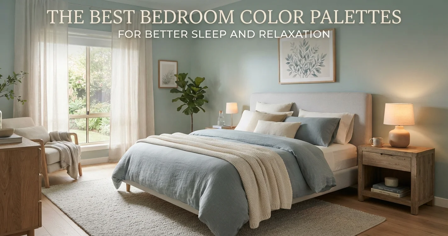
Imagine stepping into your bedroom after a long day. The lights are low, the sheets are crisp, and the walls… well, the walls are either screaming at you or gently whispering, “It’s time to rest.” That’s the power of paint.
Choosing the best bedroom color palettes for better sleep and relaxation isn’t just about aesthetics. It’s about creating an environment that signals your brain to power down. Science backs this up: colors influence heart rate, melatonin production, and even stress levels.
I have been writing about home design for over 15 years, and I can tell you this: the right hue can be as effective as a white noise machine. Let’s walk through the shades that will turn your bedroom into a true sanctuary.
Why Color Matters for Sleep Quality
Your eyes send signals directly to the pineal gland, which controls your sleep-wake cycle. Bright, stimulating colors like neon orange or high-contrast red can increase alertness. Calm colors, on the other hand, lower blood pressure and encourage drowsiness.
According to color psychology principles, cooler tones are naturally linked to tranquility. Think of a misty forest or a calm lake. That’s why hospital recovery rooms often feature soft blues and greens. For a deeper dive into structuring your entire living space for wellness, check out our guide on smart space planning.
The Undisputed Champion: Soft Blue
If you only repaint one room in your house, let it be the bedroom—and make it blue. Multiple studies show that blue hues, especially muted, dusty blues, are associated with the highest levels of calm.
Think of shades like “Hale Navy” (but watered down) or a gentle powder blue. These colors mimic the sky just after sunset, a natural cue for mammals to wind down. Pair it with white trim and natural linen bedding for a look that feels crisp but cozy.
- Best for: People who struggle with anxiety or racing thoughts at bedtime.
- Tip: Avoid electric or neon blues. Stick to muted, grayed-out tones.
Green: Bringing Nature Inside
Green is the color of balance. It sits right in the middle of the spectrum, making it incredibly easy on the eyes. A sage green or a mossy olive can make a bedroom feel like a forest retreat.
This palette works wonders if you live in a busy city. It brings a sense of the outdoors in without being too literal. For those who love natural textures, combine green walls with wooden furniture and plenty of plants. You can also explore more ideas on blending indoor and outdoor vibes in our garden design section.
Lavender and Muted Purple: For Deep Relaxation
Purple has long been associated with royalty and luxury, but lavender is its softer, sleepier cousin. This hue is actually a mix of blue (calming) and red (stimulating), but when muted heavily with white or gray, it becomes deeply relaxing.
Lavender is particularly effective for people who meditate before bed. It creates a slight spiritual or ethereal quality in the air. Use it on an accent wall or as a secondary color in textiles to avoid making the room feel too “feminine” or cold.
Warm Neutrals: Beige, Greige, and Clay
Not everyone loves color on the walls. If you prefer a minimalist or Scandinavian aesthetic, warm neutrals are your best friend. However, not all neutrals are created equal.
Stark white can feel sterile and harsh. Instead, look for “greige” (gray + beige) or clay tones. These have warmth but stay out of the way. They provide a blank canvas for sleep without visual stimulation. For more advice on curating a cohesive home, visit our home design category.
Colors to Avoid in the Bedroom
Some colors are great for a dining room or a playroom but terrible for sleep. Here is a short list of what to skip:
- Bright Red: Increases heart rate and alertness. Not ideal for winding down.
- High-Contrast Black and White: Too much visual energy. Think of a chessboard—not relaxing.
- Neon Yellow: Overly stimulating. It is the color of taxis and caution signs for a reason.
If you love these colors, use them sparingly in art or accessories, not on the walls.
Quick Reference: Best vs. Worst Bedroom Hues
To make your decision easier, here is a simple comparison table showing how different color families affect your sleep environment.
| Color Family | Sleep Rating | Best Use |
|---|---|---|
| Soft Blue | ★★★★★ (Excellent) | Main wall color |
| Sage Green | ★★★★☆ (Great) | Main wall or accent |
| Lavender | ★★★★☆ (Great) | Accent wall or textiles |
| Warm Greige | ★★★★☆ (Great) | Minimalist bedrooms |
| Bright Red | ★★☆☆☆ (Poor) | Avoid entirely |
For further reading on how color psychology interacts with daily living, I recommend checking out this comprehensive resource on home and garden wellness. It offers great insights into creating a balanced living environment.
How to Combine Palettes the Right Way
A single color is nice, but a palette is better. For example, you might paint the walls a soft greige and use sage green for the curtains and throw pillows. The key is to use the 60-30-10 rule: 60% dominant color (walls), 30% secondary color (furniture or bedding), and 10% accent (art or lamps).
Stick to colors that are neighbors on the color wheel. Blue and green work beautifully together. Lavender and greige are surprisingly sophisticated. Avoid pairing a calming blue with a bright orange throw—that contrast wakes up the brain.
If you are still unsure, try painting a large piece of foam board and living with it for a week. Lighting changes how paint looks dramatically. For more tips on creating a complete home atmosphere, visit our main blog.
Frequently Asked Questions
1. What is the best color for the bedroom ceiling?
White is the safest bet for a ceiling. However, a very pale blue or lavender can create a “sky” effect that promotes relaxation. Avoid dark colors on low ceilings as they can feel claustrophobic.
2. Can I use dark colors for sleep?
Yes, if done right. Dark navy or charcoal can feel like a cozy cocoon. Just make sure the room has good ambient lighting so it doesn’t feel like a cave during the day.
3. Does trim color affect sleep?
Yes. White trim creates a crisp contrast that can be stimulating for some. For a softer look, paint the trim the same color as the walls (monochromatic) in a slightly different sheen.
4. What about wallpaper?
Wallpaper is fine as long as the pattern is subtle. Large, busy floral prints can be overwhelming. Stick to textural grasscloth or very faint geometric patterns.
5. How many colors should I use in one bedroom?
Stick to three maximum. More than that, and the room feels chaotic. A dominant wall color, a secondary color for large furniture, and a single accent color for decor.
6. Do I need to paint all four walls the same color?
No. An accent wall behind the bed is a popular choice. Use your calming color on three walls and a slightly darker or bolder version on the accent wall for depth.
7. Can I use beige if I want better sleep?
Absolutely, but choose a warm beige with pink or yellow undertones. Cool beige with gray undertones can feel flat and uninviting. Warmth is key for relaxation.
Conclusion
Your bedroom is more than just a place to store a bed. It is a recovery station for your brain and body. Choosing the best bedroom color palettes for better sleep and relaxation is an investment in your health.
Start with soft blues, earthy greens, or muted lavenders. Avoid anything too bright or high-contrast. And remember, you don’t have to paint the whole house—just this one room. If you transform it well, you might just find yourself sleeping through the night for the first time in years.