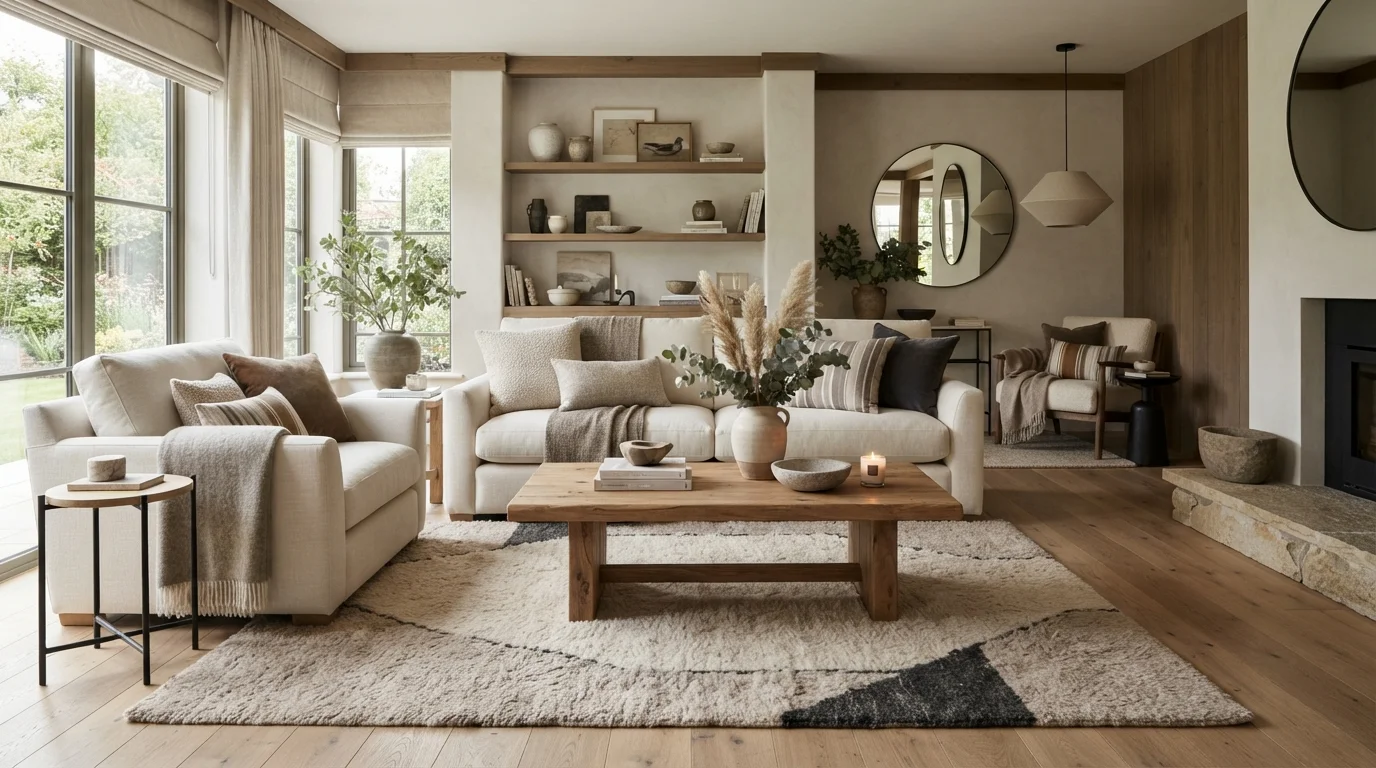
When you hear “neutral color palettes,” do you immediately think of boring, beige boxes? You’re not alone. But the truth is, a well-executed neutral scheme is one of the most sophisticated tools in interior design. It creates a calm, timeless foundation that lets texture, shape, and natural light shine.
The secret lies in understanding that neutral doesn’t mean plain. It means thoughtful. It means layering warm beiges, soft greiges, creamy whites, and rich taupes in ways that feel curated, not flat. Let’s walk through the exact strategies that turn a neutral room from bland into breathtaking.
Why Neutral Color Palettes Work So Well
Neutrals are the ultimate background players. They don’t shout, but they set the stage for everything else in your space. A neutral palette makes a room feel larger, more open, and infinitely more flexible. You can switch out accent pillows or artwork without repainting your walls.
Psychologically, neutrals promote relaxation. They reduce visual noise and help your brain decompress after a busy day. That’s why you see them in luxury hotels and spas. But the key is to avoid monotony by introducing variation in space planning and material choice.
The Key to Making Neutrals Feel Rich: Warmth and Depth
The biggest mistake people make is choosing one neutral and sticking with it. A single beige paint on all four walls, with beige furniture, creates a flat, lifeless room. The fix is simple: mix warm and cool undertones. Pair a warm taupe sofa with cool white walls. Add cream curtains and a dark wood coffee table.
Another secret is using value contrast. That means combining light, medium, and dark shades. A pale linen sofa pops beautifully against a charcoal rug. A dark walnut sideboard adds weight to a room with light oak flooring. This contrast is what keeps the eye moving and interested.
Texture: The Magic Ingredient for Neutral Spaces
If color is the melody, texture is the harmony. In a neutral room, texture does all the heavy lifting. You can have a fully monochromatic beige palette and still create a stunning room by layering different textures.
- Soft textures: Velvet throw pillows, chunky knit blankets, linen curtains
- Hard textures: Smooth marble, rough brick, matte metal
- Natural textures: Woven jute rugs, rattan chairs, raw wood beams
- Glossy textures: Lacquered side tables, glass vases, ceramic accents
Try this: Place a chunky wool throw over a smooth leather sofa. Set a matte ceramic vase on a shiny lacquered tray. The friction between different surfaces makes the room feel intentional and layered, not flat. For more ideas on structuring your layout to highlight these textures, check out other home design insights on our site.
Neutral Living Room Ideas That Wow
The Layered Beige Living Room: Start with light beige walls. Add a medium beige linen sofa. Introduce a darker caramel leather armchair. Use a cream and beige patterned rug. Finish with brass lamps and green plants. The result is warm, welcoming, and anything but boring.
The Monochrome Greige Vibe: Use a greige (gray + beige) on the walls. Choose a charcoal gray sofa. Add silver and pewter accessories. Use a soft white sheepskin rug. This scheme feels modern, sophisticated, and slightly moody.
The Cream and Wood Combination: Paint walls in a warm cream. Use light oak furniture. Add white linen textures. Bring in black metal accents for edge. This is ideal for small spaces, as it maximizes light while adding natural warmth.
How to Add Pops of Color Without Breaking the Neutral Vibe
You don’t have to live in a colorless world. Neutrals love small, intentional color accents. The trick is to choose your accent color carefully and limit it to 10–15% of the room. Earthy terracotta, muted sage green, deep navy, or ochre yellow all work beautifully.
Start with a single accent piece: a terracotta vase, a navy blue throw blanket, or artwork with warm ochre tones. This creates a focal point without overwhelming the neutral foundation. You can easily swap these out seasonally to refresh the room.
Warm Neutrals vs. Cool Neutrals: Which Should You Choose?
Understanding undertones is crucial. Warm neutrals have yellow, pink, or red undertones. They feel cozy and inviting. Cool neutrals have blue, green, or gray undertones. They feel crisp and modern.
| Feature | Warm Neutrals | Cool Neutrals |
|---|---|---|
| Best for | North-facing rooms, cozy vibes | South-facing rooms, sleek look |
| Typical paints | Beige, cream, taupe, camel | Greige, dove gray, icy white |
| Metal pairings | Brass, gold, copper | Silver, chrome, nickel |
| Mood | Inviting, earthy, relaxed | Sharp, airy, sophisticated |
For a balanced approach, mix a warm neutral on large surfaces (walls, sofa) with a cool neutral on accessories (rug, pillows). This creates tension and interest. For further reading, explore our blog for more expert advice on balancing temperature in your palette.
Common Mistakes When Using Neutral Color Palettes
Mistake 1: Forgetting to layer texture. As discussed, texture is non-negotiable in a neutral space. Without it, your room looks like a showroom that no one lives in.
Mistake 2: Ignoring lighting. Natural light changes the look of your neutral paint throughout the day. Always test paint samples on your walls and observe them at different times before committing.
Mistake 3: Using all same-value neutrals. A beige sofa on beige carpet against beige walls is a recipe for flatness. Mix light, medium, and dark values.
Mistake 4: Skipping natural elements. Plants, wood, stone, and rattan breathe life into neutral schemes. They add organic texture and a sense of growth. To integrate these elements beautifully into your overall layout, you might also enjoy reading about outdoor living trends that blend interior comfort with nature.
Neutral Color Palettes for the Kitchen and Bedroom
Kitchen: Use warm white shaker cabinets with a beige backsplash. Install a dark wood island for contrast. Add brass hardware and a marble countertop. The mix of smooth and matte textures prevents the kitchen from feeling sterile.
Bedroom: Opt for a linen bed frame in oatmeal. Use soft beige bedding with a textured throw. Try a wool rug in a darker tan. Keep walls a clean cream. Add a leather bench at the foot of the bed for an unexpected tactile moment.
FAQ: Neutral Color Palettes
How do I stop my neutral room from looking boring?
Layer three different textures (soft, hard, natural) and mix light and dark shades. Add one accent color in small doses. A room with visual depth never feels boring.
What are the best neutral paint colors for living rooms?
Popular choices include Sherwin-Williams Agreeable Gray (a warm greige), Benjamin Moore White Dove (a soft cream), and Farrow & Ball Elephant’s Breath (a warm taupe). Always test in your specific light.
Can I mix wood tones in a neutral room?
Absolutely. Mixing wood tones adds richness. Just ensure they share a similar undertone (all warm or all cool) to keep them cohesive. Dark walnut with light oak works well if both are warm.
What colors go best with a beige sofa?
Cream, white, taupe, navy blue, olive green, and terracotta all pair beautifully. Beige is incredibly versatile and works with both warm and cool accents.
Should I use gray or beige for a neutral scheme?
Neither is inherently better. Choose based on the room’s lighting and your preference. Gray is cooler and more modern; beige is warmer and more traditional. Many designers now use greige for the best of both worlds.
How do I choose the right neutral for a north-facing room?
North-facing rooms lack warm light. Counteract this by using warm neutrals with yellow or pink undertones. Avoid cool grays as they can make the room feel cold and cavernous.
Is it okay to use only neutral colors in a child’s room?
Yes, but add plenty of color through toys, art, and bedding. A neutral backdrop in a child’s room provides a calm environment and grows with them as their tastes change.
Where can I find more neutral palette inspiration?
For a wealth of curated ideas and expert techniques on building beautiful spaces, you can find valuable resources from home and garden enthusiasts online. Many guides offer detailed breakdowns of color theory applied to real homes.
Conclusion: Embrace the Art of Neutrals
Neutral color palettes are not a shortcut or a cop-out. They are a deliberate design choice that rewards attention to detail. By focusing on undertones, contrast, and texture, you create a home that feels serene, sophisticated, and anything but boring.
Start small. Pick one room, test your paint samples, add one new texture, and watch your space transform. Neutral doesn’t have to be quiet — it can be the most powerful statement you make.