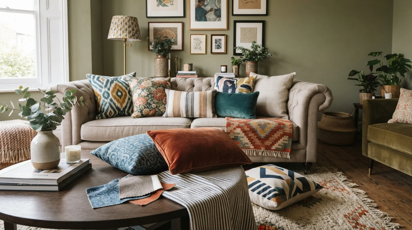
Have you ever walked into a room that felt completely flat and lifeless? The culprit is often a lack of depth. The magic of a professionally styled home comes from the confident mixing of patterns and textures.
It is a skill that can transform a boring space into a layered, inviting sanctuary. Many homeowners shy away from it, fearing a cluttered or chaotic look. But with the right principles, you can master this art like a true designer.
This guide will walk you through proven strategies to combine florals, stripes, and organic textures into a cohesive masterpiece. By the end, you will have the confidence to pull fabrics and furniture together in a way that feels intentional and expensive.
Why Mixing Patterns and Textures Creates a Designer Look
Our eyes crave variety. A room that relies on a single fabric or finish, like all cotton or all wood, feels one-dimensional. Combining different home design ideas introduces visual rhythm and tactile interest.
Patterns add personality and movement, while textures add warmth and depth. Think of a chunky knit throw paired with a velvet sofa or a woven jute rug under a sleek glass coffee table. That contrast is what makes a space feel curated.
When done right, this approach creates harmony without being boring. It tells a story about your style and makes your home feel truly lived-in and layered.
Rule 1: Start with a Neutral Base
Before you go wild with bold florals or geometric prints, establish a calm foundation. A neutral base—like a beige linen sofa, a whitewashed wood floor, or a cream wool rug—gives your eyes a place to rest.
This backdrop allows your patterned pieces to shine without overwhelming the room. It is the canvas for your creative layering. You can then introduce color and print without the space feeling chaotic.
Neutrals don’t have to be boring. Vary the textures in your base. Combine a matte linen sofa with a shiny silk pillow or a rough-hewn wooden coffee table. The interplay of textures within neutrals is incredibly sophisticated.
Rule 2: Vary the Scale of Your Patterns
One of the most common mistakes is using patterns that are all the same size. When everything is similar, the eye gets confused. Instead, create a clear hierarchy using scale.
Use a large-scale pattern, like a oversized floral or bold abstract, as your focal point. Then, pair it with a medium pattern, such as a classic stripe or a small geometric. Finally, add a micro pattern, like a subtle pinstripe or a tiny polka dot.
This approach creates depth and prevents any single element from fighting for attention. For example, pair a large-scale palm leaf curtain with a medium houndstooth pillow and a micro-textured faux fur throw on the same sofa.
Rule 3: Use a Unifying Color Palette
You can mix plaid, stripes, and florals as long as they share a common color thread. This is the secret weapon of professional designers. Pick two to three colors, and let those anchor your choices.
For a calming effect to refine your space planning, use variations of blues and whites. You can have a blue ikat pattern, a navy stripe, and a white linen with a blue floral. The shared blue connects them all.
If you love a bold look, choose one high-contrast color like mustard or emerald and sprinkle it across your patterns. The repetition of that color creates a visual thread that ties everything together beautifully.
Rule 4: Balance Busy Patterns with Solid Textures
When you have a room full of busy prints, the eye needs a break. That’s where solid textures step in to save the day. A solid velvet pillow or a chunky ribbed knit blanket provides visual silence.
Think of textures as the punctuation marks in your design story. A smooth leather chair next to a patterned woven rug creates a pleasing contrast. The texture grounds the pattern and adds a tactile element.
Explore professional interior design resources that can help you identify which solid textures best complement your chosen prints. This balance is what separates a cluttered room from a layered one.
Rule 5: Layer Textures from Floor to Ceiling
Patterns often get all the attention, but texture is the unsung hero of interior design. You should feel a room as much as you see it. Start at the floor with a sisal or shag rug, then add a leather ottoman.
Move up to the furniture. Combine a sleek metal lamp with a chunky ceramic vase. Add a velvet sofa and a linen curtain. Finally, think about ceiling texture. A grasscloth wallpaper or even a simple wood beam adds the final layer.
This vertical layering creates a rich, enveloping environment. It makes the room feel cozy, expensive, and well-thought-out.
Sample Pattern Mixing Playbook
To help you visualize the rules, here is a simple guide. Use this table as a cheat sheet when shopping for your next room refresh.
| Pattern Category | Example | Best Paired With |
|---|---|---|
| Large Scale | Oversized floral, large ikat | Solid velvet, small stripe |
| Medium Scale | Houndstooth, gingham | Large abstract, micro polka dot |
| Micro Scale | Pinstripe, tiny dot | Medium geometric, chunky knit |
| Organic Texture | Jute, linen, raw wood | Smooth leather, metallic accent |
Use this as a starting point. Remember, the goal is contrast, not chaos. Trust your eye after establishing the base rules.
Practical Ways to Start Today
You don’t need to redesign your entire living room to practice these skills. Start small. Pick one surface, like your sofa or your bed, and experiment.
- Swap out two solid pillows for one solid and one patterned in the same color family.
- Add a textured throw in a contrasting material like faux fur or chunky cable knit.
- Introduce a patterned rug that pulls together the colors already in your room.
- Layer a natural jute rug under a patterned wool rug for instant depth.
These small changes yield big visual impact. Once you see how a single textured anchor changes the energy of a room, you will feel empowered to go further. For broader inspiration, check out more home design ideas that showcase these principles in action.
Common Pitfalls to Avoid
While mixing is fun, there are a few traps that even seasoned decorators fall into. Avoid using more than three major patterns in a single room to prevent visual noise.
Don’t forget about negative space. Every pattern needs a blank wall or a solid surface to breathe. Also, avoid matching everything perfectly. A slightly off color or an unexpected stripe adds character and sophistication.
Finally, don’t ignore the power of garden design principles. The same layering and texture rules apply outdoors, blending hardscapes with soft foliage. Your home should flow seamlessly from interior to exterior.
Frequently Asked Questions (FAQ)
1. How many patterns can I mix in one room?
Stick to three patterns maximum for one cohesive space. Use one large, one medium, and one micro to create a clear hierarchy. This keeps the look curated rather than chaotic.
2. Can I mix floral and plaid?
Absolutely. The trick is to keep a unified color palette. If your floral has a soft green and your plaid has the same green, they will live together beautifully. Also, vary the scale significantly.
3. What is the easiest texture to start with?
Linen is incredibly forgiving. It adds immediate depth and sophistication to any room. Pair a linen sofa or curtain with a cotton or wool rug for an instant layered effect.
4. Should patterns match or contrast?
Contrast is almost always better. Matching patterns look flat and commercial. Contrasting scales, colors, and prints create visual interest and a designer feel.
5. How do I mix patterns in a small room?
Keep the wall neutral and focus patterns on smaller accents like pillows, throws, and art. Use fewer patterns but with stronger contrast. Light textures will also keep the space feeling open.
6. What colors work best for beginners?
Stick to a monochromatic palette with one accent. For example, mix navy, light blue, and cream patterns. This is almost impossible to get wrong and creates a serene, sophisticated look.
7. Can I use patterns on the floor?
Yes, a patterned rug is a fantastic way to anchor the room. Keep the furniture and walls more neutral and let the floor pattern be the star. It adds warmth without overwhelming the space.
8. Is it okay to mix wood textures?
Yes, mixing wood tones adds incredible depth. Just make sure there is a connecting element, like a similar grain pattern or a shared undertone (both warm or both cool). Keep the contrast to two wood tones max.
Conclusion
Mixing patterns and textures is not about following strict rules; it is about building confidence through understanding. You now have the tools to layer a room that feels both dynamic and harmonious.
Start with a neutral base, vary your scales, and unify your colors. Add textures to break up the visual noise and give your room a tactile soul. Your home should tell your story, one layered print at a time.
For more curated inspiration and outdoor design integration, explore outdoor living ideas that bring texture and pattern into your garden spaces. Happy decorating!